
Digital signage news monitor; the only multi-source, fully searchable archive of major digital signage and DOOH news and resources.
The overall impression of the project from the design point of view is rather “clean”.
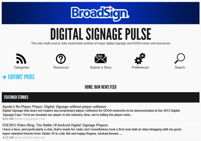
Along with a thoughtful approach to the typography and color selection, what’s standing out is a “BroadSign” banner – it looks alien to the rest of the page from both typography and a coloring perspective. It also competes with “Digital Signage Pulse” header, confusing a visitor – which one is the name of the project?
Technically, the project name should be the main header, so apparently it’s “BroadSign”. But then, “Digital Signage Pulse” is bigger in font size, so it’s unclear. These two should not be competing. Only by clicking BroadSign banner we realize that it leads to another project and the connection between the two projects remains unknown. If “Digital Signage Pulse” is a BroadSign project, this should be explained in some way.
The “Digital Signage Pulse” header is clickable – and it’s good, however there is no “title” text for the link and visitor has to look in the destination link at the bottom of the page to determine where the header is leading. Also, by web rules, the link should be inactive on the page of destination. “The only multi-source, fully searchable archive of major digital signage and DOOH news and resources” – is a sub-header, which should not be leading anywhere. It’s just a subhead. No link enxessary.
I like the simple Web 2.0 menu that is both graphic and text, however, it is not functional the best way it could be. First of all, this project is an archive. The main purpose of the archive is to contain information and provide fast and comprehensive search. Search should be pretty much the main functionality of the project, and should absolutely be expanded and remain on every page of the site.
I like a simple look of the search, but it should have more comprehensive functionality allowing search by date, one word, word combinations, categories, and other parameters that are used in creating of the archive. So, you should provide an expanded simple search on each page and it should have the main focus, and also the search should have an expanded advanced features that user may utilize for their convenience.
I am a bit confused by the Editor’s picks text button – it’s unclear what is the criteria of the “picks” – will it be something random or “hot”, or something I should read – and why I would read it. Unless it’s very clear why I should click the button, which by the way looks like a header with no content, this button should be either removed or supplied with an explanation of the click result menu where it exists already as a category. Separating it from the main menu is very confusing to the user.
Only by browsing the site for a while I was able to guess that Editor’s picks is Top Digital Signage News. This is very confusing, the Category should not have two different names and be linked to by two different ways.
Then we see a news feed for one preselected Category – Top Digital Signage News. Since it’s the main category that is always displayed on the main page, it absolutely should be present in a list of categories under the main menu Categories button – user should not be guessing that to get back to this category they need to get back to the main page. Also, the name of the category user is currently browsing should be highlighted in the expanded Category list at all times.
Home page contains “Home: Raw News Feed”. I am not sure if the typical user knows that “raw” means “unsorted”, and I would either alter the name to make it clearer.
The news feed is simple. I like that it displays Header, lead, time and source. However, I do have a problem with color choice. The feed desperately lacks color. The white on gray hover text is unreadable, the gray underline is barely visible and hardly separates header from the lead. Since everything is monochromatic on this page, the text in the feed just blends, it’s really hard to visually separate header link from the lead test. In my opinion, it should have color! It’s your choice, but I personally (and professionally) believe that the source link should absolutely be presented as a link with a proper highlighting.
I welcome the articles sorting by date, but the black tripes are extremely heavy for the rest of the page that seems rather aerial. I welcome the idea of the stripe, but it should not be overwhelming. Besides, light text on darker color is harder to read, especially when there is lots of other copy to read in more common dark on white style. Reader should be constantly switching from reading dark on white to white on dark – it’s exhausting for the eye and definitely is not a plus for a heavy text-based project.
An absolute bonus for the project would be using an ajax technology to display page or at least its contents in a floating window just like Google does. It will definitely save your users time and effort if they can preview the source to determine if they would want to give more time to reading it by clicking the link.
I welcome the pagination, however, I personally would display more page links than only 4. There are 77 pages, and you have the whole site-width. You can absolutely use it to give the user an ability to click page 10 if they want to. Display as many pages as possible within the width of the page. I assume, 20 will be fine.
Another great functionality for the unsorted feed would be collapsible blocks by the date. When the user previews the unsorted feed, pre-expand the most recent day and collapse blocks for the rest of the days displayed on the page. Give a button “expand all”, remember the choice with “cookies”.
It’s great that registered user has an ability to preselect a category they would want to see when they open your resource. It would be great if user also could “bookmark” certain articles and set up the way they view the article blocks – collapsed or expanded.
The Preferences area lost some categories’ icons, and Save and Logout buttons are positioned a bit strangely – not to the right, not in the center.
I believe “Resources” button belongs to the bottom menu, it’s more of a “Help” page. There are two “Submit a story” links on the page, and they have different functionality – they should both work the same. Contact us page had emails listed, I would also add a contact form.
It’s hard for me to determine the difference between “Suggest a source”, “Submit your story”, and “Submit your listing for Digital Signage Resources”. If I can’t, users may not either. You should either explain the difference or remove the excess of the emails. Also, you already have a form functionality to Submit a story, why use the email for that? The simpler it is, the better.
It definitely will add credibility to your project if you add at least one phone number and an address (Could be Toll Free and P.O. Box) and definitely real people’s names (and photos) in About section which I recommend to add along with a story about the project ill definitely give the project a human face.
Digital signage news monitor is the only multi-source, fully searchable archive of major digital signage and DOOH news and resources.